Element Library
Headings & Text (H2)
Lead paragraph uses lead class to highlight key information. Main container uses my-5 to add whitespace between top and bottom of page if no breadcrumbs are used. If breadcrumbs are present, use mt-3 mb-5. Depending on content and padding preceding it, you may want to add mt-0 to first H2 to reduce unnecessary whitespace.
Subheading (H3)
To help different heading levels stand out better from one another, the standard H3 heading can be modified with the classes text-bright-light and h4. This helps add color and break up sections, and is especially useful for pages with lots of heading levels.
Subheading (H4)
H4 should include the class h5 modifier to help distinguish it from stylized h3.
Paragraphs will sit flush beneath a heading as they do not have top padding or margins, but do include a default gutter padding, which usually provides sufficient whitespace between any element that follows.
Subtitle Styling
Note
In some cases, you may need to adjust heading margins, depending on what is before or after it. For example, if a heading is followed directly by a subheading, the default top margin for the subheading is typically too high, resulting in too much white space between the headings. Use mb-3 or mt-3 to fix this.
Heading hierarchies
Text-xl, h-bold, parent elements
Image Styles
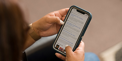
Images are great for adding visual interest and breaking up content on a page. Images can be embedded within text, used to decorate cards, etc.
Floating Images

Optional caption to be placed here
Paragraph - Nulla facilisi. Vivamus sagittis lectus justo congue blandit. Sed eget felis eget nulla consectetur congue. Maecenas metus. Fusce ac orci blandit purus facilisis hendrerit. Nullam ut metus quis ipsum convallis euismod. Phasellus turpis purus, pharetra sit amet, dictum eget, ornare eget, ipsum. Morbi pulvinar quam vel sapien. Nulla vitae nisi vitae leo luctus volutpat.
Paragraph - Nulla facilisi. Vivamus sagittis lectus justo congue blandit. Sed eget felis eget nulla consectetur congue. Maecenas metus. Fusce ac orci blandit purus facilisis hendrerit. Nullam ut metus quis ipsum convallis euismod. Phasellus turpis purus, pharetra sit amet, dictum eget, ornare eget, ipsum. Morbi pulvinar quam vel sapien. Nulla vitae nisi vitae leo luctus volutpat. Sed faucibus dignissim nunc. Nulla facilisi. Vivamus sagittis lectus justo congue blandit. Sed eget felis eget nulla consectetur congue. Maecenas metus. Fusce ac orci blandit purus facilisis hendrerit. Nullam ut metus quis ipsum convallis euismod. Phasellus turpis purus, pharetra sit amet, dictum eget, ornare eget, ipsum. Morbi pulvinar quam vel sapien. Nulla vitae nisi vitae leo luctus volutpat. Sed faucibus dignissim nunc.
Optional caption to be placed here
Paragraph - Nulla facilisi. Vivamus sagittis lectus justo congue blandit. Sed eget felis eget nulla consectetur congue. Maecenas metus. Fusce ac orci blandit purus facilisis hendrerit. Nullam ut metus quis ipsum convallis euismod. Phasellus turpis purus, pharetra sit amet, dictum eget, ornare eget, ipsum. Morbi pulvinar quam vel sapien.
Paragraph - Nulla facilisi. Vivamus sagittis lectus justo congue blandit. Sed eget felis eget nulla consectetur congue. Maecenas metus. Fusce ac orci blandit purus facilisis hendrerit. Nullam ut metus quis ipsum convallis euismod. Phasellus turpis purus, pharetra sit amet, dictum eget, ornare eget, ipsum. Morbi pulvinar quam vel sapien. Nulla vitae nisi vitae leo luctus volutpat. Sed faucibus dignissim nunc. Nulla facilisi. Vivamus sagittis lectus justo congue blandit. Sed eget felis eget nulla consectetur congue. Maecenas metus. Fusce ac orci blandit purus facilisis hendrerit. Nullam ut metus quis ipsum convallis euismod. Phasellus turpis purus, pharetra sit amet, dictum eget, ornare eget, ipsum. Morbi pulvinar quam vel sapien. Nulla vitae nisi vitae leo luctus volutpat. Sed faucibus dignissim nunc.
Optional caption to be placed here
Note
Images should have alt text if they communicate information or contribute to the meaning of the surrounding content. If text is present in the image, it should be included as alt text, or can be provided in an alternative way in the surrounding text. Images that do not contribute significantly to understanding the content should be marked as decorative.
List styles
Simple List
Example below adds mb-4 class to ul element to ensure there is adequate space between the end of a list and any content below.
- Thing 1
- Thing 2
- Thing 3
- Thing 4
- Thing 5
Complex List
For more complicated information, this list style can be used to break content across an additional line within same list item.
- Item One
Descriptive text about the item - Item Two
Descriptive text about the item - Item Three
Descriptive text about the item
Table Example
The CMS provides several default table styles that can be easily created using the component tool. This example uses the striped version but modifies the element with "bg-primary text-white" to create a bold table header. This version is used across the website.
Boxes are a useful way to highlight and organize content. To create a box, a div of any size can be styled with a background color using bg- and p-4 to provide padding around the content. Headings can also be included in boxes, but should be modified with mt-0 to eliminate the white space above the heading, helping the box look symmetrical. Bolder colors from the USU template can be used, but the colors below are recommended for most use cases. Light grey boxes (bg-gray-light) are recommended for most purposes. The bg-info color is useful for highlighting key information or calls-to-action. To ensure proper contrast, headings and text should use the text-white class. The blue-light color (bg-blue-light) is especially useful for highlighting instructional content or special information. Include mx-3 to create to inset the box, helping it stand out when embedded alongside regular text. Cards can be created by adding the card-body class to a div and placing it within a parent div using the card class. Cards serve a similar function as boxes but include much of the styling by default, such as padding and borders. The simple cards below can also be customized with optional classes to define things like card footers and headers, as seen in Card 2 and 3 respectively. List groups are also useful for listing multiple items or links within a card. Over forty study rooms are available for student use in the library. Study rooms can be reserved for 2-hour blocks up to 2 days in advance. A sanitary room provided for visitors caring for infants. Located in Room 139, First Floor West. Room does not need to be reserved. When cards in a row don't have the same amount of content within each card, their heights may vary. To align a row of cards vertically, add class w-100 to the parent div. Additional card guidelines and options can be found in the USU template guide. Some text about this. Some text about this. Some text about this. Use for: Showcasing key subpages and other info in a scannable, visually-appealling layout; particularly useful on landing pages as interior navigation option. Optional text Located in Room 158G, First Floor West. See the Circulation Desk to access. Room does not need to be reserved. Use for: Showcasing key subpages and other info in a scannable, visually-appealling layout; particularly useful on landing pages as interior navigation option. Use for: Highlighting key personnel in the body of a page. Better on full-width pages with no sidebar. Alternative to top/bottom contact panel on interior pages. Not recommended with sidebar unless contact info is only relevant to small part of page. Otherwise, top/bottom panel recommended. There are three main types of buttons. Buttons are useful for highlighting important actions or steps in navigation, and for this reason their use should be limited on most pages. Use for: General button style for most use cases. Can be paired together for related actions, but avoid excessive use. Use for: Calling attention to important actions that users are here to make. Recommend only one button of this type be used per page. Use for: A more muted button that can serve as an alternative to a simple link. Arrow provides visual interest Usually progresses to another page or step in process. Particularly useful for landing pages where multiple "see more" buttons may be appropriate. Do not use btn-lg with this button style. Icons can add visual interest to content and help key elements stand out, while ideally also helping communicate information at a glance. USU uses the Font Awesome v.4 icon library, which makes embedding icons easy using the OmniCMS component feature. Avoid overuse of icons by sticking to the following use cases. Use for: Major sections on landing pages and other situations when visual interest is needed to bring attention to key elements. Embedding the icon within the heading element will stylize the icon to match heading size and color. Use for: Helping lists and structured content stand out. Particularly useful for listing contact information. Avoid including icons in anchor tags when pairing with links. ProQuest Central is a large, multidisciplinary collection that pulls together scholarly and popular sources across a wide variety of subject areas. Includes academic journals, magazines, newspapers, and more. Trial ends May 16th.
Room/Space
Description
Capacity
How to Reserve
Room 101
Large meeting space with computer/projector and flexible seating and table arrangements. A lapel mic, presentation clicker, and camera remote are also available at the circulation desk.
100
Contact Breanna VanDyke at breanna.vandyke@usu.edu
Room 154
Lecture-style classroom space with computer/projector. Zoom and IVC/Broadcast capable.
95
Visit scheduling.usu.edu
Room 208
Faculty seminar room with computer, large monitor, projector, and whiteboard. Zoom capable. For faculty/staff use only.
15
Reserve Room 208
Foyer Table
Open foyer area at entrance of library building. Table and 2 chairs provided. For approved USUSA club, USU class or department use only.
2
Reserve the Foyer table
Box Examples
H3 Gray boxes
H3 Callout boxes
Instructional/Tips Box
Card Examples
Card 1 (Simple)
Card 2 (List Group)
Card 3 (Header)
Note
Image Cards

Heading

Heading
Heading
Icon Card
Virtual/Spatial Computing
Collaboration Spaces
Embedded Contact Card

Button Styles
General Buttons
Call to Action Button
Progress Button
Note About Using Buttons
Icons
Paired with Heading
Books & More
Paired with Text
Note
Alerts
Promotional Alert
Service & Maintenance Alerts